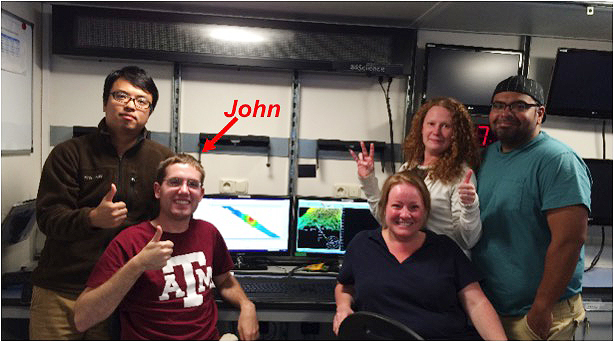
Hello from the R/V Falkor, I’m Vaughn, a geophysics graduate student from the University of Houston. I consider myself very lucky to be adventuring in the Pacific with the superstar crew of Falkor and the passionate, spirited team of scientists compiled by Dr. William Sager, Tamu Massif expert.
Setting a Course
As Suraida promised in her blog update “On Our Way and Already Mapping”, today’s blog will explain the system of processing data collected during our voyage to Tamu Massif. In the previous blog, you were introduced to the EM-302 multi-beam echo-sounder, which is the sonar system used to map the ocean floor. Ideally, Falkor would travel a steady, straight course through still water and produce no bubbles or anomalies of any kind. However, in the real world, bubbles are produced, the ship rolls side-to-side, pitches back and forth, and bobs up and down, making even the best data “noisy.” These raw readings of messy depth data do not truly reflect the shape of the ocean bottom, and while Falkor produces beautifully detailed maps, they still required some human “clean-up.”
Software Corrections
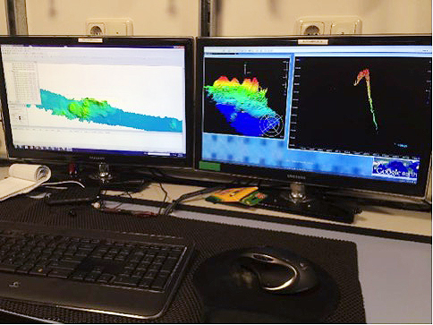
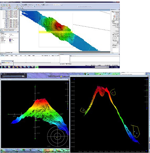
The CARIS software system allows the team to remove erroneous results (or “bad soundings”) from the multi-beam sonar data. This results in a more accurate image of the beautiful Pacific seafloor. Our fellow scientist on board, John Greene, has taught each of Dr. Sager’s watchstanders to do the processing. Looking at a close-up of the CARIS screen, you can see that we are processing around a seamount. From the broad swath of data along our tract, he shows us how to display a portion of it in 3D (see image below). The image can then be viewed in 3D by clicking, dragging, and rotating the axes, and viewed like a piece of bread in vertical slices. In both views, points that are alone and away from the bulk of the data (called outlier points) are circled and removed with a click of the mouse.
Man and Machine
Sounds easy, don’t you think? Unfortunately, the process isn’t completely straightforward, so a bit more time and experience goes into it. Those reading the data have to use their knowledge of geology to guide decisions about which points to remove to get the most accurate image. Once the obvious outliers (like the ones circled in the figure) are removed, the reasoning begins. Observers have to deduce if questionable points could possibly represent a natural structure on the ocean floor. The final image here shows you an example of the before and after of a seafloor image – this is an actual section of our swath that was processed by the team.
This combination of human judgment and experience, coupled with advanced technology tools, is a powerful and successful method. Stay tuned and follow along as we continue to explore the secrets of #TamuMassif.